
ProviderVodafone
Mobile number01093403465
Amount80.50 EGP
Service fees34.34
Available offers (3)
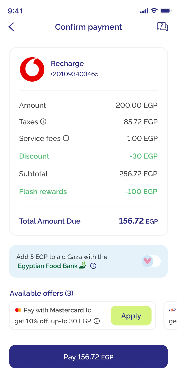
Pay with Mastercard toget 10% off, up-to 30 EGP
Apply
Pay with InstaPay toget 10% off, up-to 30 EGP
ApplyAdd 5 EGP to aid Gaza with theEgyptian Food Bank
Payment methods
InstaPay Apple Pay
 Valu
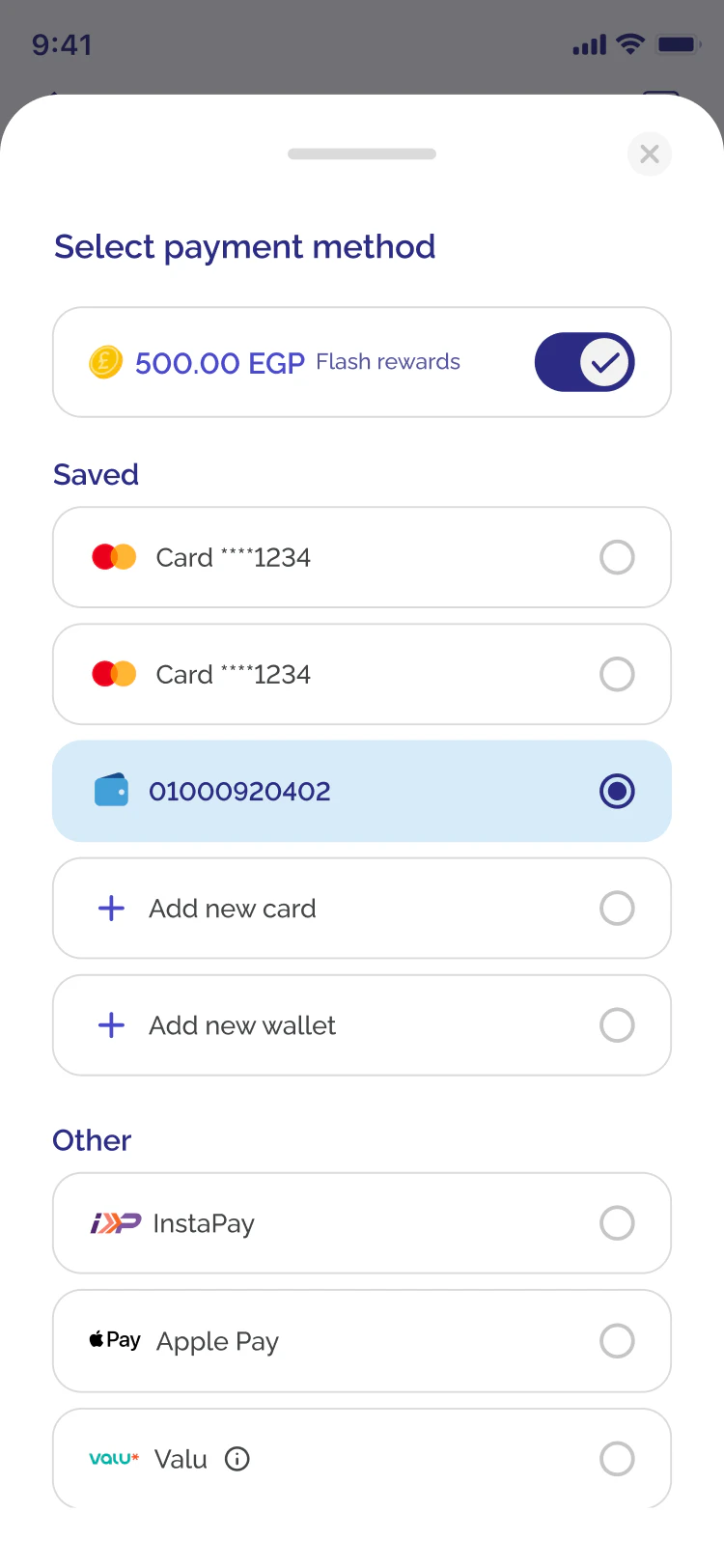
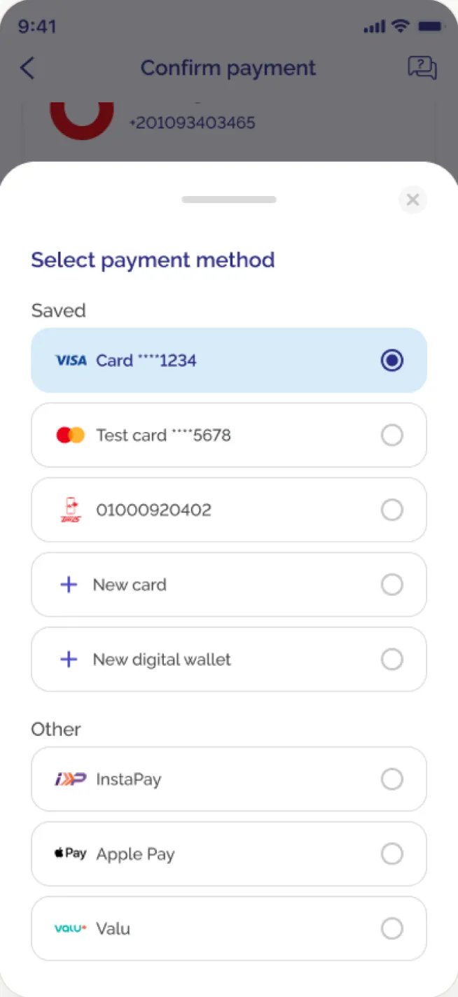
Select payment method
Saved
 01000920402
Other
InstaPayApple PayValuProviderVodafone
Mobile number01093403465
Amount80.50 EGP
Service fees34.34
Available offers (3)
Pay with Mastercard toget 10% off, up-to 30 EGP
ApplyPay with InstaPay toget 10% off, up-to 30 EGP
ApplyAdd 5 EGP to aid Gaza with theEgyptian Food Bank
Payment methods
InstaPayApple PayValuSelect payment method
Saved
01000920402Other
InstaPayApple PayValuPrevious checkout screen
Redesigned checkout screen
Flash · Checkout · 2025
Making room for
more ways to pay.
Flash was adding new payment methods, so the checkout screen had to be redesigned to fit them. I compared two designs in 126 unmoderated usability tests, and the parts they share went live.
- Role
- Product designer, from the PM's ticket to the analysis of the results
- Company
- Flash, consumer fintech
- Year
- 2025
- Tools
- Figma, Maze
- 126unmoderated usability tests on two checkout designs
- 90%+task success on every task, in both designs
- Heldcheckout conversion in the quarter after launch
Start here · before you read on
Try it yourself
Try the checkout yourself
Try a five-second screen test, then a checkout task, before you read the results. They're based on the Maze study I ran before launch. This is a prototype, so no money changes hands.
You vs the testers
Testers’ numbers come from the 126 Maze tests. Your column fills in at the end.
01 · The brief
More payment methods, two constraints
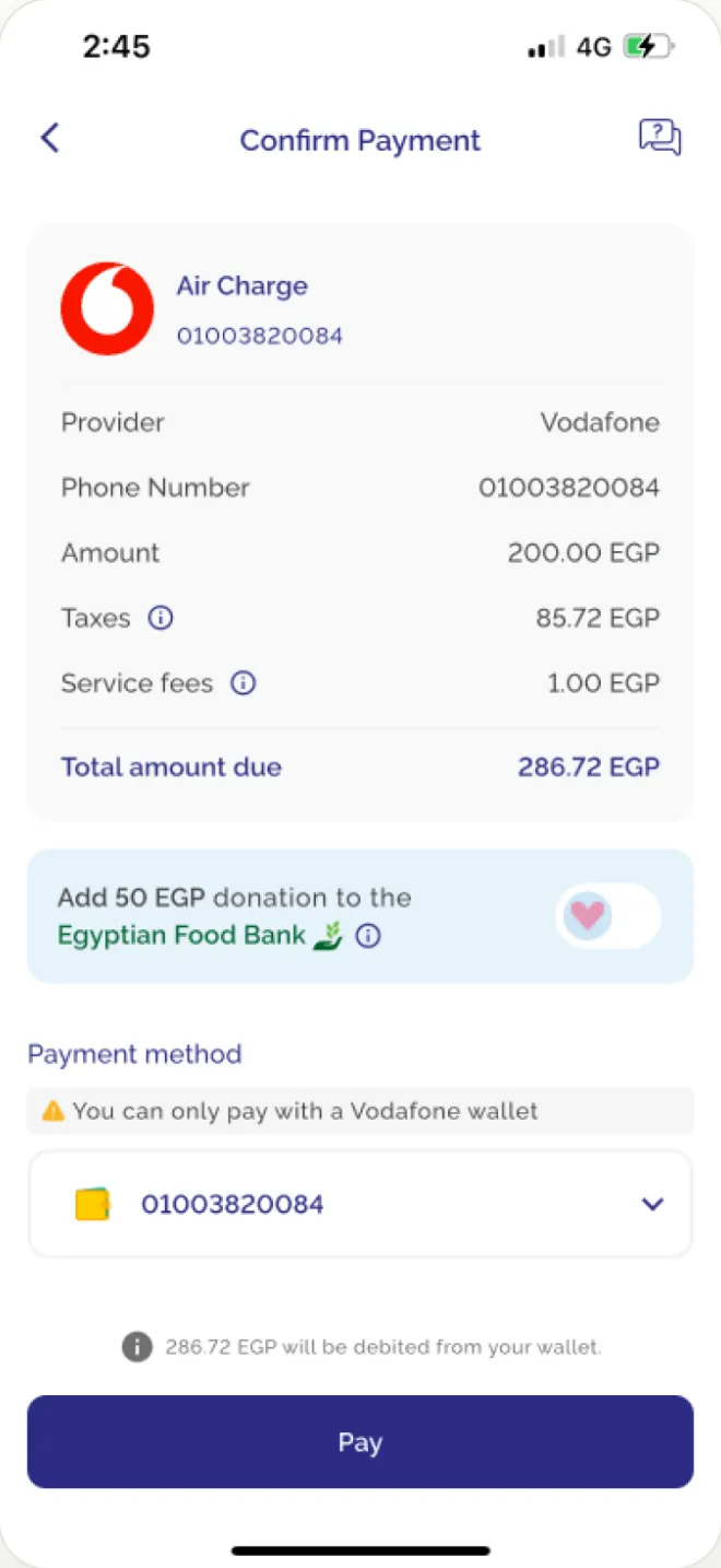
Bills, recharges and payments all go through one checkout screen. Flash wanted more ways to pay on it: InstaPay, digital wallets and more cards. The live checkout listed payment methods in a dropdown, so every added method made the open list longer, and people would have to scroll to reach the one they wanted. The new screen had to hold them all, and two numbers could not get worse.
Constraint 1
Success rate must not drop
Checkout conversion is the revenue line. A design that looks cleaner but converts worse is a failure.
Constraint 2
Time to pay must not rise
Every added second at checkout is drop-off risk. New options couldn't slow down the people who pay today.
02 · Users and flows
Two paths through one checkout
People with a saved payment method and people with nothing saved land on the same checkout screen. Either of them can also apply an offer, add a donation or pay part of the total with Flash rewards before paying, and each one updates the total.
Existing userMethod saved
Keeps the selected method
- Checkout
- Tap Pay
- Payment success
Picks another saved method
- Checkout
- Methods bottom sheet
- Saved
- Tap Pay
- Payment success
Adds a new method
- Checkout
- Methods bottom sheet
- New
- Tap “Add card or wallet and pay”
- Add it, then pay
- Payment success
New userNothing saved
- Checkout
- Pick a method
- Tap “Add card or wallet and pay”
- Add it, then pay
- Payment success
Add-onsEither user, on the checkout, before paying
- Apply an offer
- Discount comes off, total updates
- Switch on the donation
- Donation added, total updates
- Switch on Pay with Flash
- Rewards pay part, the card pays the rest
Then
- Tap Pay, as above
03 · Directions
Choosing where to show payment methods
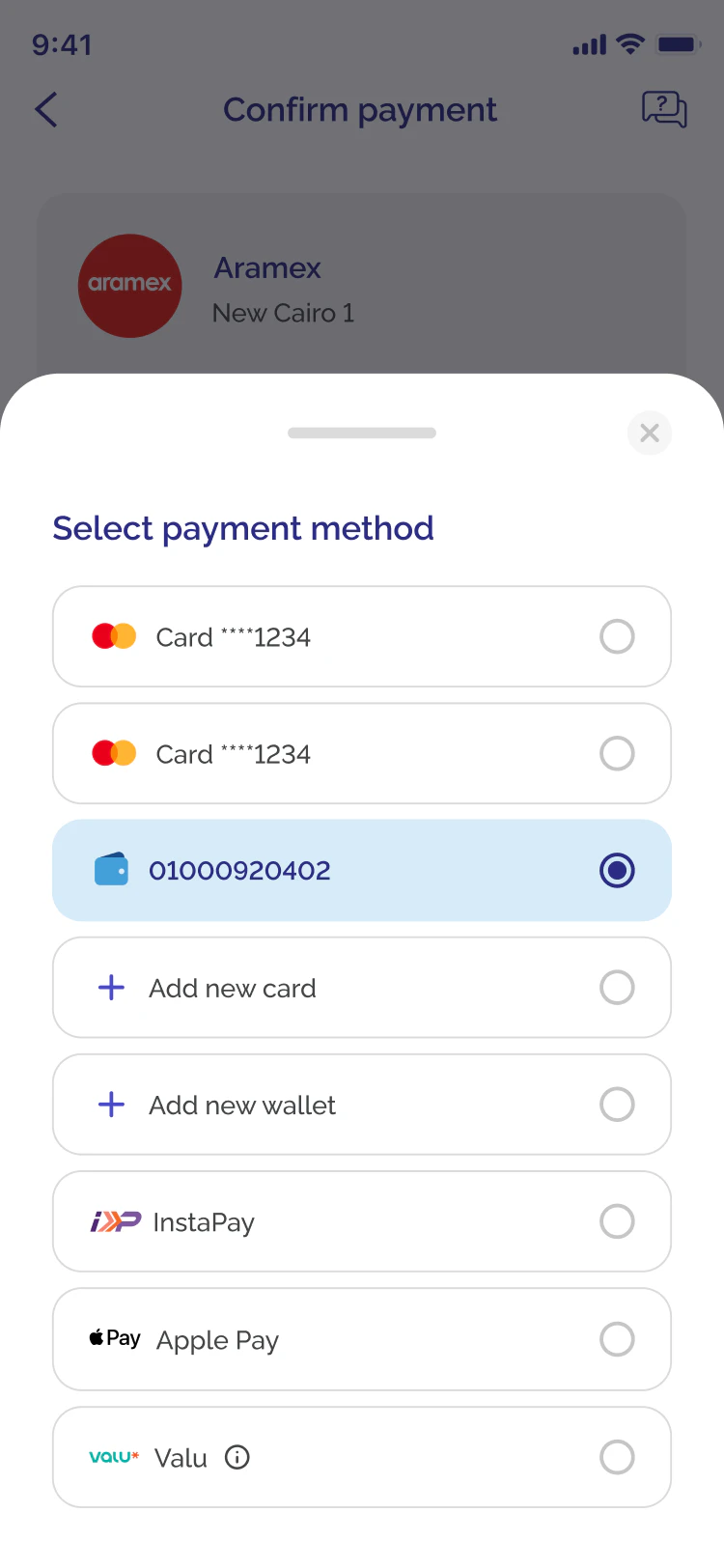
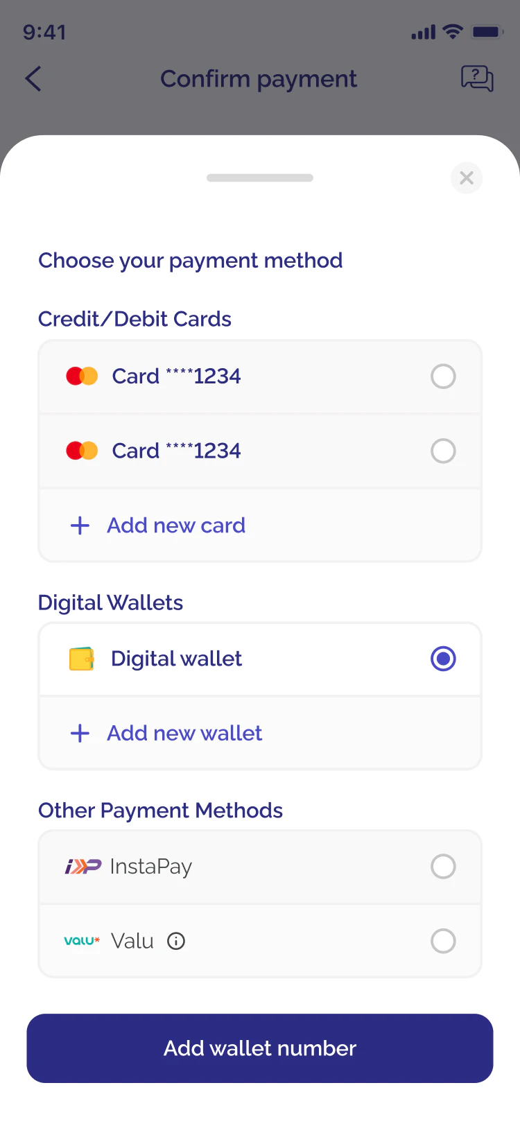
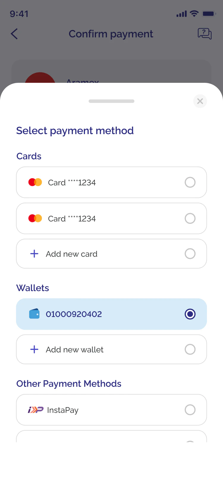
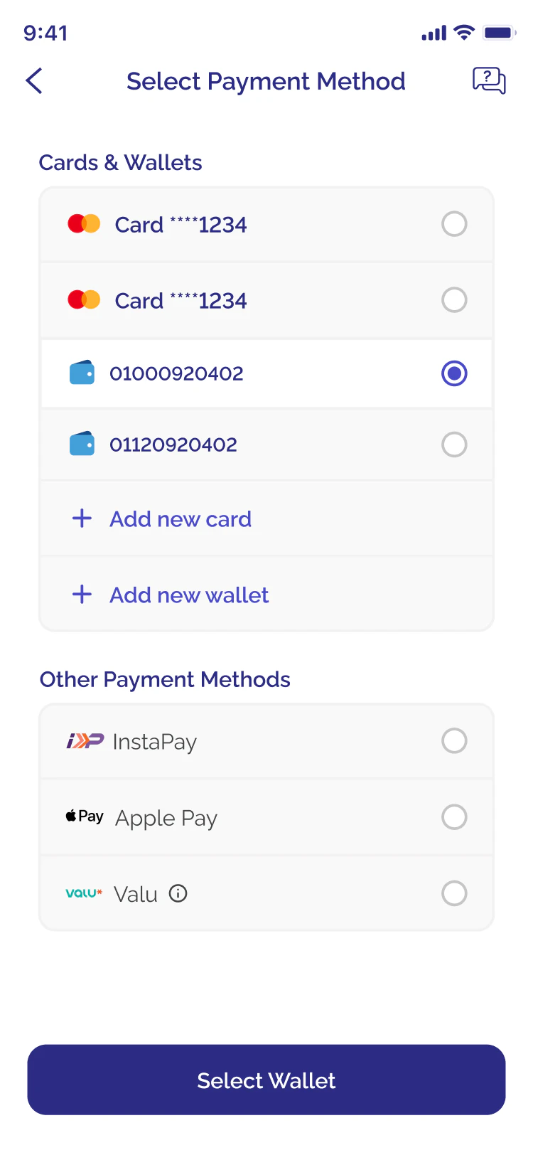
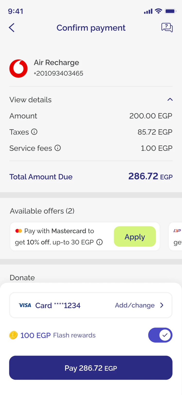
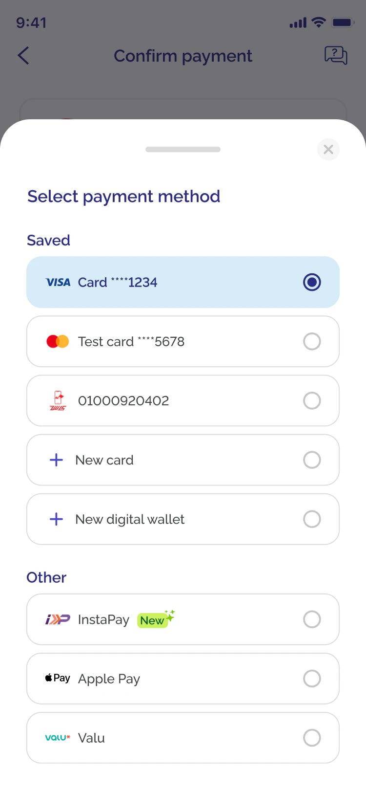
I first tried a separate screen for choosing a payment method. That meant leaving checkout for a single choice. A bottom sheet kept the checkout visible, so I took that direction forward and explored how to group saved methods and new options.
Payment method selection
Swipe for more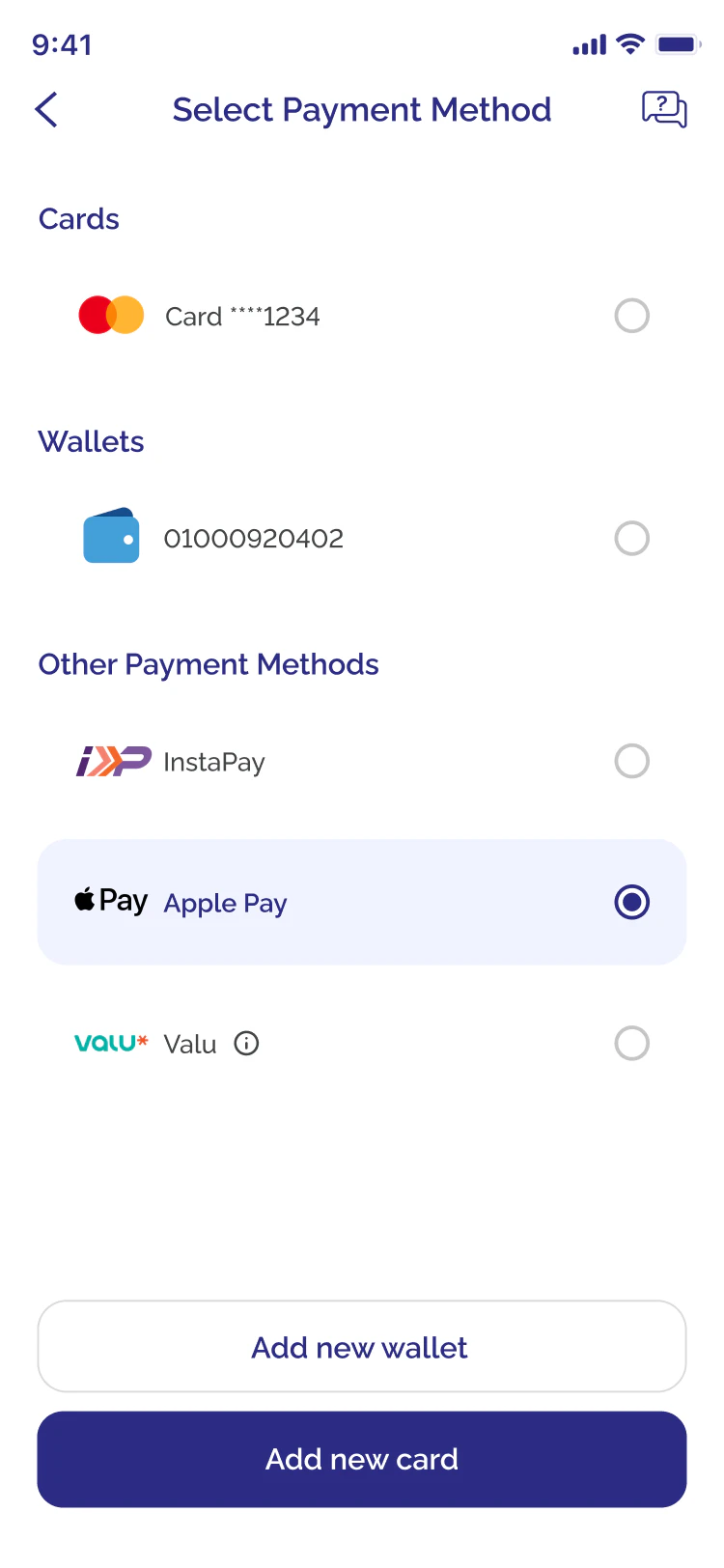
Payment summary
Swipe for more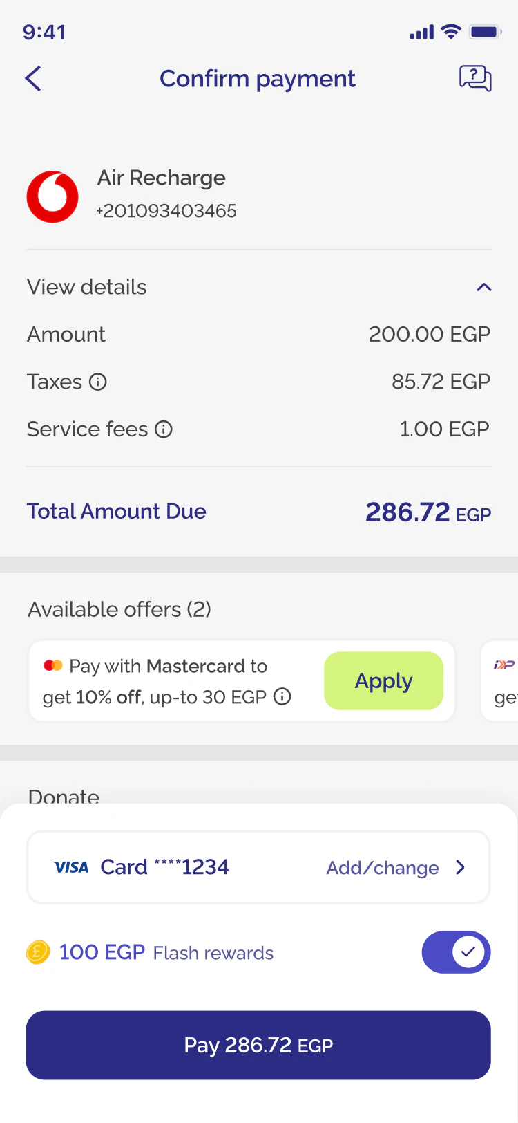
More drafts
7 screens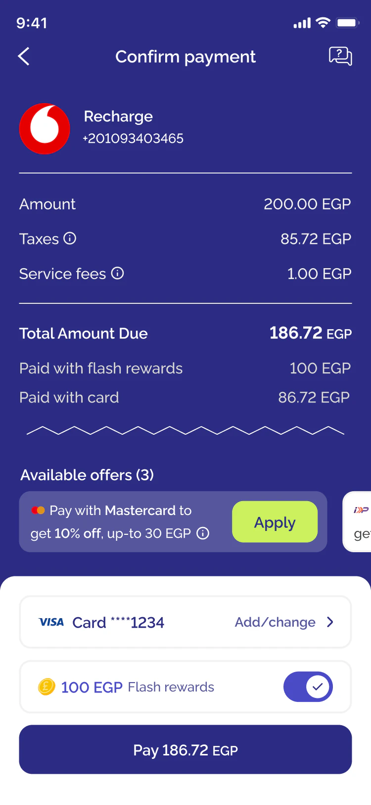
04 · The two designs
A bottom sheet to hold them all
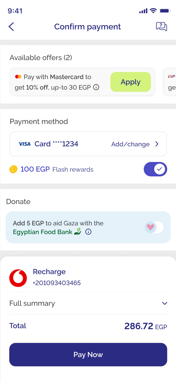
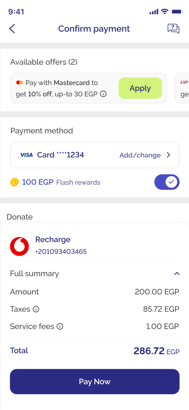
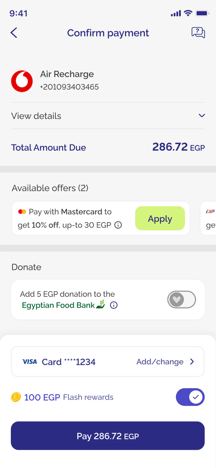
Every payment method moves into a bottom sheet, so new options can join without crowding the screen. The summary collapses to a single total and expands on demand. The two designs share all of that. They differ only in what sits next to the Pay button, so both went through the test.
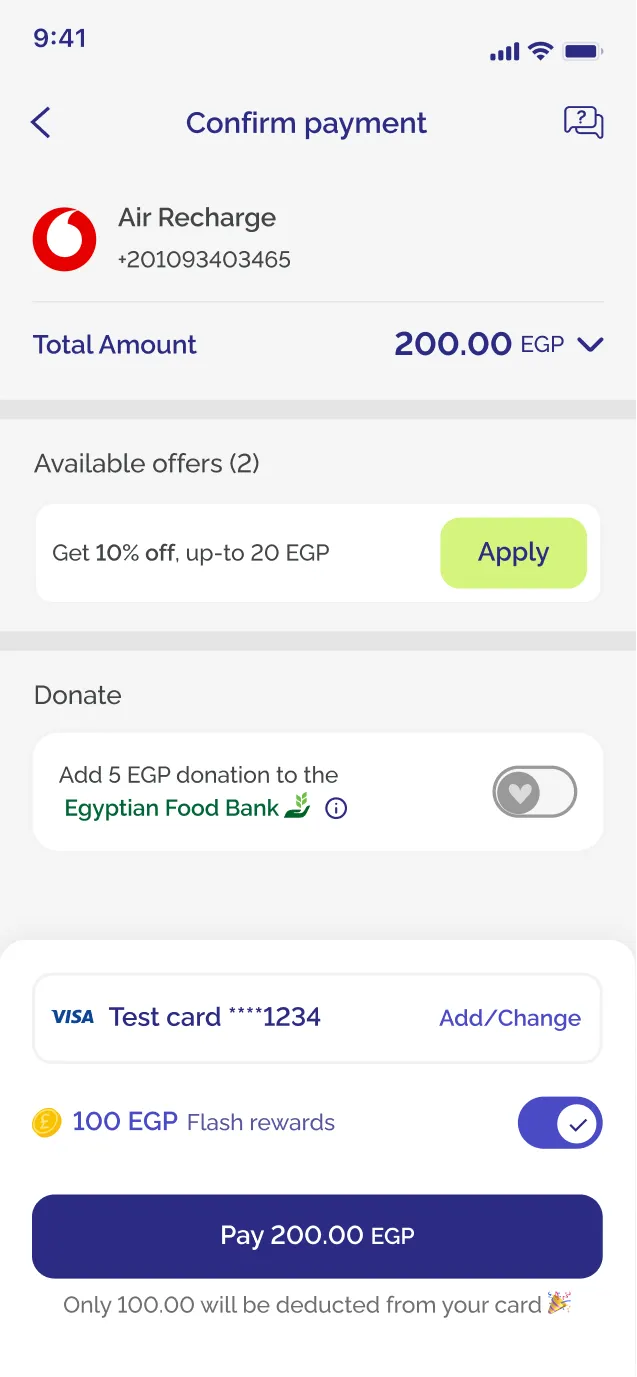
Design 1
Payment method next to Pay
The selected method sits right above the button, and the button repeats the amount: Pay 200.00 EGP.
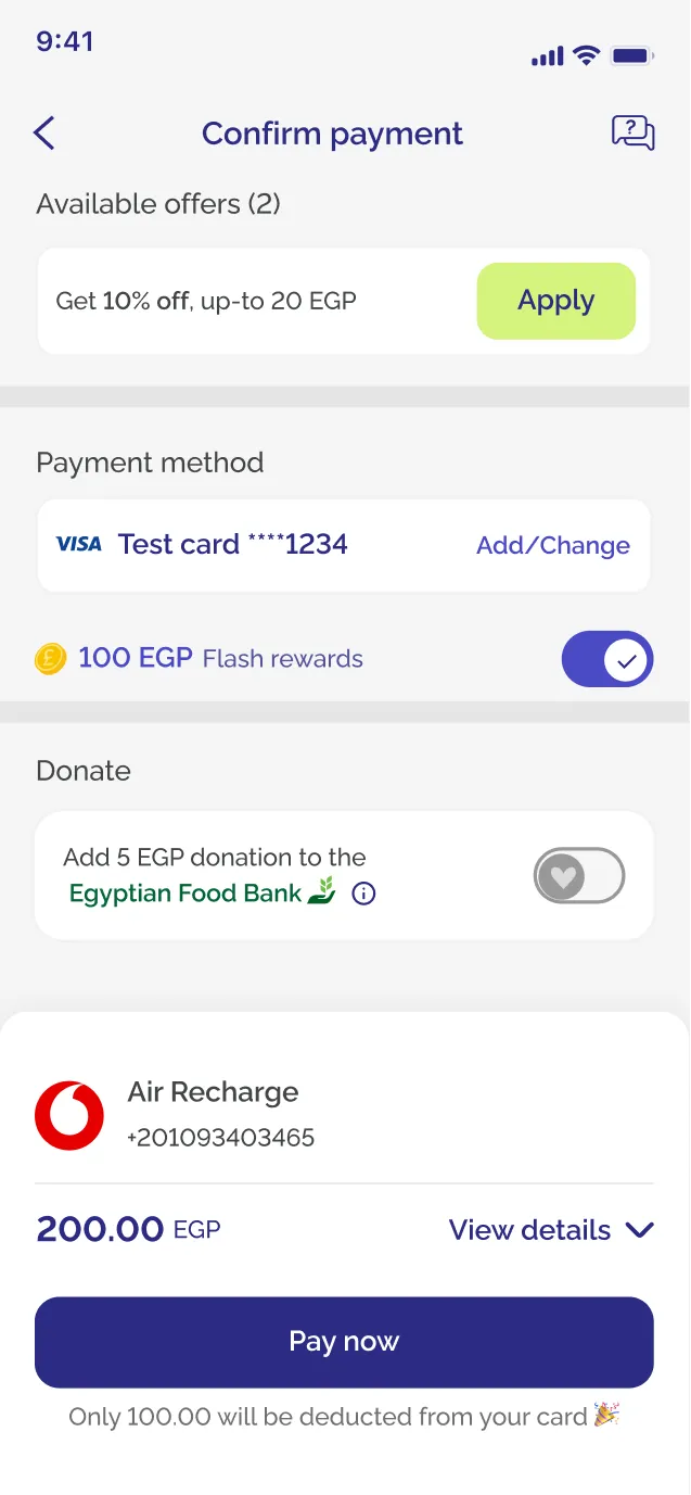
Design 2
Summary next to Pay
The order summary sits right above the button. With the total already there, the amount on the button looked redundant, so I removed it and the button says Pay now.
05 · Prototypes
Prototypes that behave like the real app
I first tried a regular click-through prototype with people in the office. Dead taps, a donation toggle with no feedback and a total that never updated kept stalling them with questions.
longer to finish checkout on the regular click-through prototype
Time to pay was one of the two numbers that could not get worse, so fake friction would have skewed the timing results.
So I built both test prototypes with Figma variables and conditional logic. They respond like the app: methods change, offers apply and the total updates live. Doing that the regular way, with one screen for every state, would have taken more than 100 screens for a single test flow. The conditional version covers it with 29.
Disclaimer: the regular prototype is only here for show. I never actually built 123 screens.Tarek
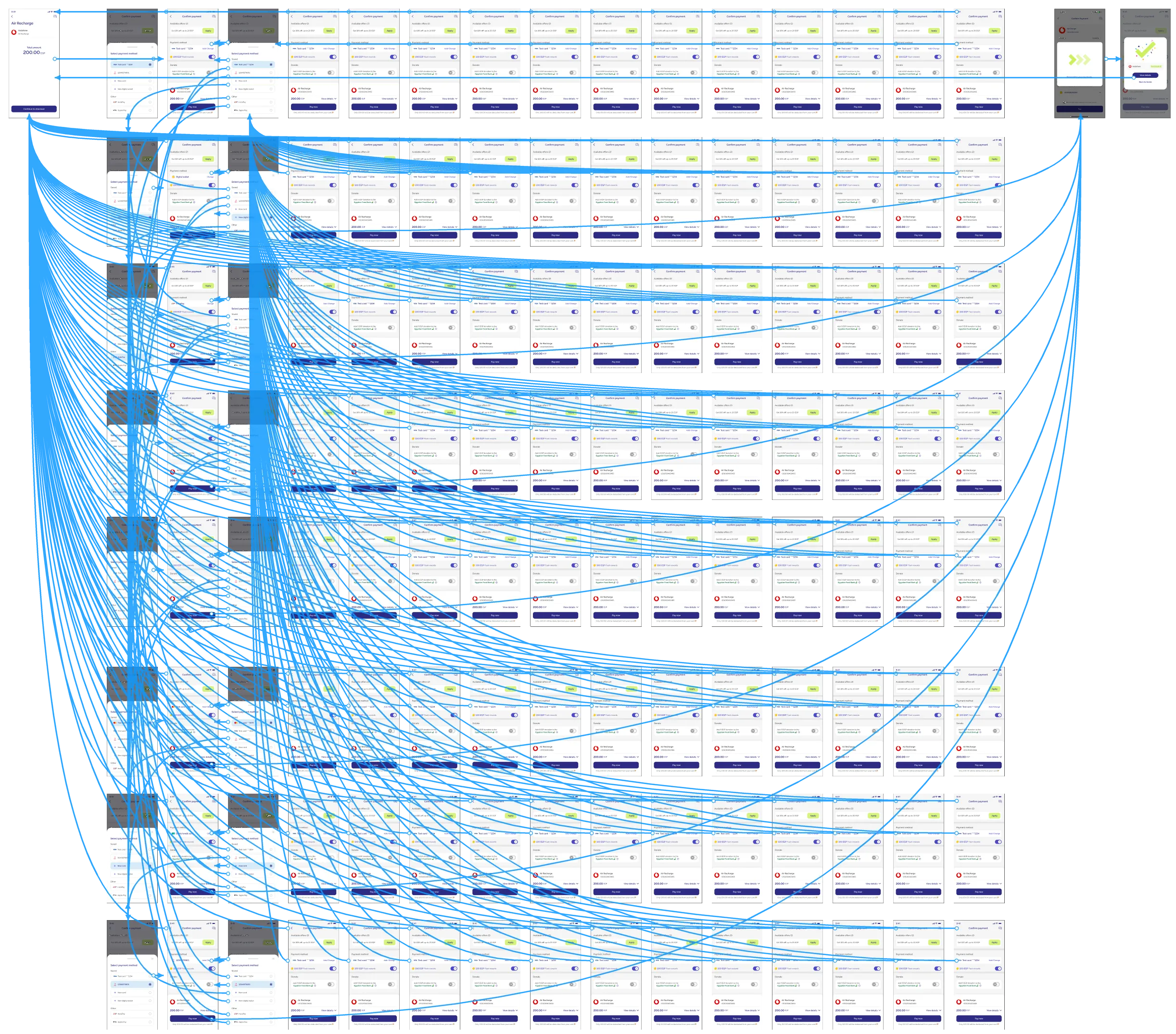 Conditional prototype · 29 screens
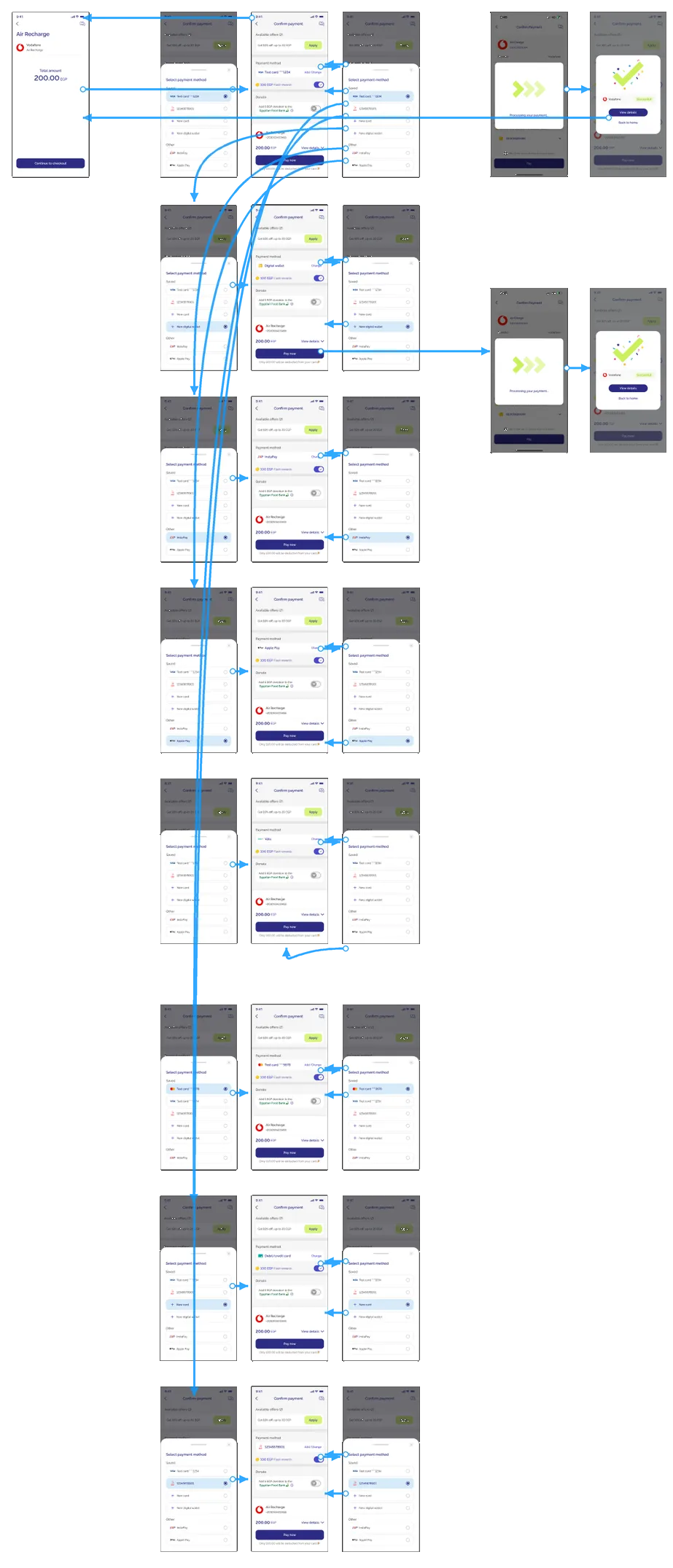 94 fewer screens
Disclaimer: the regular prototype is only here for show. I never actually built 123 screens.Tarek
What the prototype keeps track of
4 variables- #payment method
InstaPaychanges when you pick another one - #offer applied
truethe discount comes off the total - #donation
offthe toggle answers when you tap it - #total
180.00 EGPrecalculated after every change
06 · The test
126 unmoderated usability tests, run in Maze
Tasks mirrored real checkout, and every task ran on both designs. Existing users changed a payment method and applied an offer. New users added a payment method and applied an offer. Every participant confirmed upfront that it was a test and no real money would move.
- 2 designstested against each other and the live checkout
- 2 audiencesexisting power users invited by SMS in batches of 200, plus new users
- 3 signalstask success, time to complete, and which details people remember
- + 5-second testcan people spot the total amount at a glance?
07 · Results
What the head-to-head found
Both designs stayed at or above 90% task success. Design 2 was a few points higher on every task, and Design 1 was faster on every task.
- Design 1Payment method next to PayThe button says Pay 200.00 EGP
- Design 2Summary next to PayThe button says Pay now
Task success rate
Time to complete
33 to 45 participants per task for existing users, 14 to 23 for new users.
What people noticed, and what they chose
5-second test
People who remembered the total after five seconds
One dot per tester. Filled: remembered the total.
Most remembered the Vodafone logo. Some mistook the 100 EGP rewards message for the amount due.
Redesign or the live checkout
Which one people chose when shown both
33% chose Design 167% chose the live checkout
61% chose Design 239% chose the live checkout
21 of 37 new users picked InstaPay as their payment method.
08 · What went live
What went live, and why
Every test, on both designs, ran through the same two parts: payment methods in a bottom sheet and a summary collapsed to one total. Both designs cleared the success and time constraints.
On what sits next to Pay, the result was split. Design 2 had higher task success and won preference, and Design 1 was faster on every task. So we shipped the two shared parts and parked the Pay button decision. In the quarter after launch, checkout conversion held.
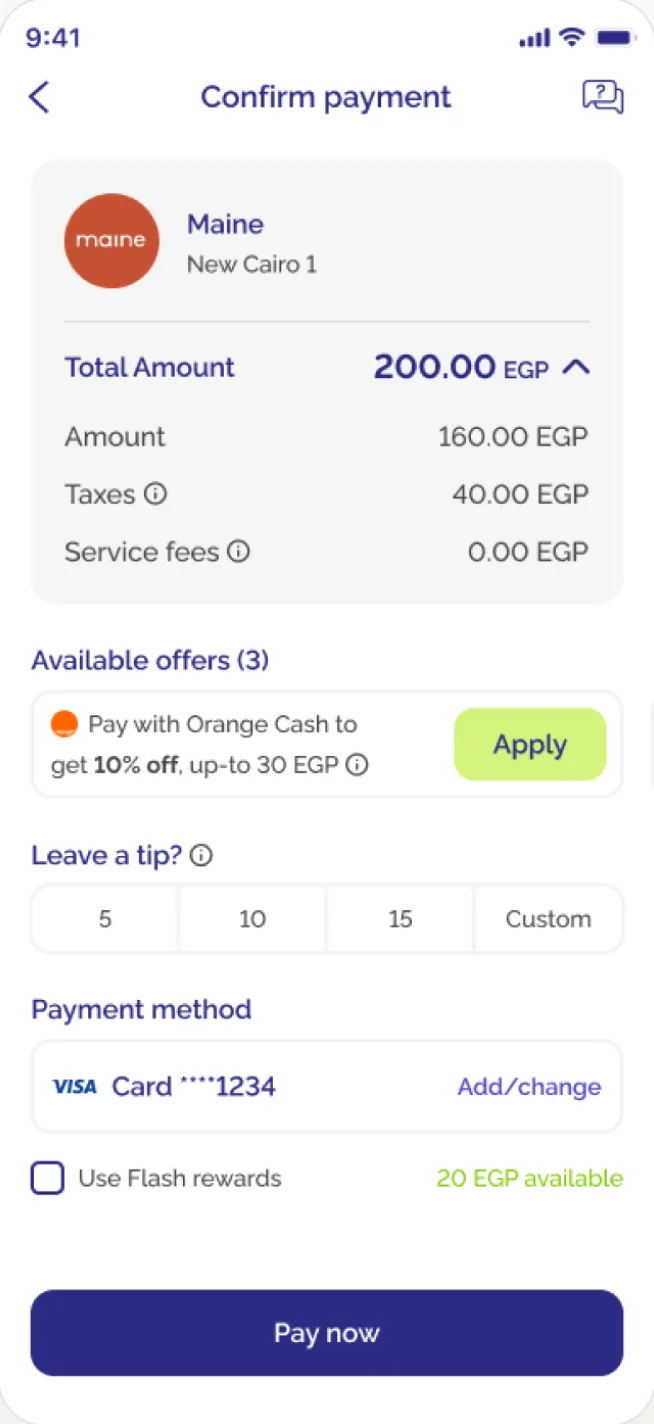
09 · Learnings
What the study taught me
Three things I would do differently, or do next.
01
We should have tested in Arabic
We built and tested in English only. Nobody caught it, me included, even though most Flash users speak Arabic. Arabic first is now my default.
02
The total belonged in the Pay button
Design 1's button said Pay 200.00 EGP, and 12 of 40 people recalled the total. Design 2's said Pay now, because the summary sat right above it and the amount felt redundant. Recall fell to 3 of 36. Looking back, repeating the amount was helping people.
03
What I'd run next
The split result says neither design was the whole answer. I'd design a third option that aims for Design 2's success rate at Design 1's speed, starting with the amount back in the Pay button, and test it in Arabic.
Spoiler: this was a bad idea. The 5-second test shows why.